Photo colour grading is not the arbitrary application of a filter; it is the art of transforming an image's colours to craft a specific mood, feeling, or style. This process transcends basic colour correction, which primarily addresses technical flaws like an improper white balance. Grading is the deliberate, artistic process of leveraging colour for visual storytelling.
Why Colour Grading Is Your Secret Storytelling Weapon
Think of colour grading as the critical element that turns a simple snapshot into a compelling narrative. The world's most accomplished photographers don't just capture moments; they shape them. They strategically use colour to direct the viewer's eye, establish a signature style, and, most importantly, evoke a specific emotional response. As renowned colorist Alexis Van Hurkman notes, "Color grading is the process of altering and enhancing the color of a motion picture, video image, or still image both electronically and photochemically... It's all about making the image express the emotion you want the audience to feel."
The right palette can instantly render a scene warm and nostalgic, cold and desolate, or vibrant and energetic. Consider the work of master photographer Steve McCurry. His powerful portraits often lean on rich, saturated colours that create a profound sense of connection and immediacy. This demonstrates how colour is not a final tweak but an integral component woven into the very fabric of the story.
The Power of Emotional Impact
Colour has a direct, scientifically-proven line to our emotions. It’s instinctual. Warm yellows and oranges feel happy and inviting. Cool blues can bring a sense of calm or even melancholy. According to a study published in the Journal of Experimental Psychology, specific colour palettes can measurably influence a viewer's emotional state and interpretation of an image. Mastering these associations empowers you to guide how your audience feels, making photo colour grading an essential part of mastering powerful visual storytelling techniques.
“Color is a power which directly influences the soul.”
— Wassily Kandinsky
This quote from the pioneering abstract artist perfectly encapsulates the essence of professional grading. It’s not about a generic notion of making a photo "better." It's about making it feel right for the intended narrative.
Before we delve into practical steps, let's establish the core concepts you’ll be working with. This table serves as a concise reference for the fundamental principles of colour theory in practice.
Core Concepts in Photo Colour Grading
| Concept |
What It Does |
Why It Matters |
| Colour Balance |
Adjusts the overall mix of colours (reds, greens, blues) to achieve a neutral starting point or a specific creative tint. |
Fixes unwanted colour casts from lighting and sets the foundation for your creative look. Getting this right is step one. |
| Contrast |
Manages the difference between the darkest and brightest parts of your image. |
Defines the mood. High contrast feels dramatic and punchy, while low contrast creates a soft, dreamy, or vintage vibe. |
| Tonal Mapping |
Controls the brightness levels of specific ranges—shadows, midtones, and highlights—independently. |
Gives you surgical control to bring out details in dark areas or recover information in bright skies. |
| Saturation & Vibrance |
Saturation boosts all colours equally, while Vibrance intelligently boosts only the less-saturated colours. |
Saturation can look artificial if overdone. Vibrance is your go-to for a more natural, pleasing pop of colour. |
Understanding these four pillars is what separates aimless slider-pushing from intentional, professional-level colour grading. Every creative look you admire is meticulously built upon these principles.
From Niche Skill to Essential Tool
The industry has taken definitive notice. The global photo editing software market, where colour grading tools are a central feature, is projected to reach USD 3.29 billion by 2032, according to a report by Precedence Research. This growth reflects the shift of grading from a specialized, high-end skill to an indispensable part of every serious photographer's workflow. A recent industry survey reveals that 80% of professional photographers consider colour grading one of their most critical post-production steps.
Ultimately, proficiency in photo colour grading is what elevates your work. It is the bridge between a technically correct photo and an emotionally resonant one. You're not just fixing images; you're giving them a soul.
Inside the Professional Colour Grading Workflow
Exceptional colour grading is not accidental. It's a deliberate, methodical process. Professionals don’t randomly adjust settings; they adhere to a structured workflow that moves from technical correction to stylistic refinement. This methodical approach is what distinguishes an amateur edit from a polished, professional final image.
It’s all about efficiency and consistency. A study of digital artists published in the Journal of Digital Imaging found that those with a structured workflow not only finish projects 30% faster but also report significantly higher rates of client satisfaction. Applying this same discipline to your colour grading will fundamentally transform your results.
Building the Foundation with Primary Corrections
Before contemplating a moody teal-and-orange aesthetic, you must establish the fundamentals. This initial stage is dedicated to primary correction—creating a clean, technically sound canvas. Think of it as priming a wall before painting.
This is where you address the basics:
- White Balance: Correct any unnatural yellow or blue tints from the lighting. The goal is corrective, not creative. Whites should appear white.
- Exposure: Set the overall brightness correctly. The image should not be underexposed or overexposed, but present a clean, balanced exposure.
- Contrast: Establish the initial separation between darks and lights to give the image foundational impact.
Bypassing this step is akin to building a house on an unstable foundation. Any creative look applied later will only accentuate the flaws you initially ignored.
Crafting the Mood with Global Adjustments
With a solid, clean base established, the artistic process begins. Global adjustments shape the overall atmosphere of the photograph. These are broad strokes that affect the entire image, setting the emotional tone for all subsequent edits.
This is where tools like Curves and the HSL (Hue, Saturation, Luminance) panel are indispensable. A gentle S-curve can introduce beautiful, cinematic contrast. Tweaking HSL sliders allows for targeted colour manipulation—perhaps shifting greens toward a golden autumn hue or desaturating blues for a more somber feel.
To dive deeper, check out our complete guide to powerful photo editing techniques that will take your grading skills to the next level.
This workflow is a structured progression from the technical to the artistic.
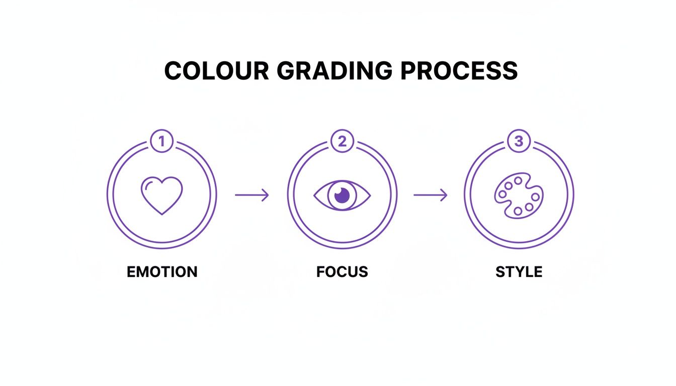
It truly boils down to three pillars: establishing the emotion, guiding the viewer's eye, and then locking in your definitive style.
Directing the Eye with Local Adjustments
Global adjustments set the stage, but local adjustments place the spotlight on your subject. Using tools like radial filters, gradients, or an adjustment brush, you can selectively modify specific areas of the image. This is the key to creating subject separation and a palpable sense of depth.
To draw attention to a person's face, a subtle radial filter with a slight increase in brightness is effective. If a bright corner is distracting, paint over it with a brush and decrease the exposure. The goal is to consciously guide the viewer's gaze.
As the legendary colorist Juan Melara put it:
"The best colorists are masters of shaping light and directing the viewer’s eye. It’s less about the colors you choose and more about where you put them."
This is how you transform a flat photo into an immersive and intentional composition.
Polishing the Final Look with Creative Finishes
This final phase is about adding your signature style—the last 10% that makes the image uniquely yours. Here, you might apply a creative LUT (Look-Up Table) to impart a complex, cinematic colour palette in a single click.
But the process doesn't end with LUTs. Consider adding subtle film grain for a more organic, textured feel. A gentle vignette can darken the edges, pulling focus directly to the center of the frame. These are the finishing touches that elevate an image from merely "good" to truly memorable.
Crafting Iconic Colour Grading Styles by Genre
Moving beyond generic presets, one understands that colour grading is fundamentally about creating a mood. Different photography genres are defined not just by their subject matter, but by the feeling they evoke. A significant part of that emotional language is derived from deliberate, genre-specific photo colour grading.
This isn’t about chasing trends; it's about understanding and delivering on audience expectations. A wedding album must feel romantic and timeless. A social media ad needs to interrupt a user's scroll. Each style demands a unique recipe for colour and tone.
The Timeless Romance of Light and Airy Wedding Photography
The "light and airy" style is a modern wedding photography classic for a clear reason: it evokes a dreamy, elegant, and timeless feeling. The objective is to create a soft, romantic atmosphere that places all focus on the joy of the day. This look is characterized by bright exposures, gentle contrast, and a soft, pastel-leaning colour palette.
To achieve this look:
- Lift Your Shadows: Avoid deep, crushed blacks. Pull the shadow point up on your curves tool just enough to impart a slightly faded, gentle feel.
- Mind the Highlights: Be careful not to "blow out" the highlights. Brightness should not come at the expense of detail in a white dress or clouds. Gently pull the highlight slider down to recover texture.
- Tame the Greens: A professional technique is to shift the hue of any greens toward yellow and then slightly desaturate them. This prevents vibrant foliage from overpowering the soft, romantic tones.
If you really want to go deep on this aesthetic, our guide for the modern wedding photo editor breaks down even more specific techniques for creating this classic look.
The Intimacy of Moody and Cinematic Portraiture
In complete contrast is the "moody and cinematic" look. This style embraces deep shadows, rich but desaturated colours, and carefully sculpted light to build drama, depth, and intimacy. It is the perfect choice for portraits intended to tell a deeper story.
Creating this look is about shaping light with colour. While the popular teal-and-orange palette is common, the true secret lies in creating contrast—not just with brightness, but with colour temperature. You might push cool blues or teals into the shadows while warming the midtones and highlights where skin tones reside. This colour contrast creates a dynamic, engaging image that feels like a still from a feature film.
As noted by senior colorist Maxine Gervais, "Colour grading is emotional engineering. You're using palettes and tones to build a feeling, guiding the viewer from a place of observation to a place of connection."
Popular Colour Grading Styles and Their Key Characteristics
To help you visualize these differences, think of colour grading like a chef's spice rack. Each genre has its go-to ingredients that create a signature flavour.
| Style/Genre |
Primary Tones |
Contrast Level |
Common Tools Used |
| Light & Airy Wedding |
Soft pastels, creamy whites, desaturated greens, warm skin |
Low to Medium |
Curves (lifted black point), HSL sliders |
| Moody Portrait |
Deep shadows, desaturated earth tones, teal & orange |
High |
Split Toning, Curves (S-curve), LUTs |
| Boudoir |
Warm, golden tones, rich reds, soft blacks, glowing skin |
Medium |
Color Balance (warming), Glow/Mist filters |
| Social/Vibrant |
Saturated primary colors, high-impact blues and oranges |
Very High |
Vibrance/Saturation sliders, Clarity/Texture |
This table is a foundational guide. The most accomplished artists understand the rules so they can break them effectively. But mastering these foundational palettes is the first step toward developing a unique, signature style.
Scroll-Stopping Grades for Social Media
Social media is a distinct arena where the primary objective is to stop the scroll. This typically requires high-contrast, vibrant, and punchy aesthetics that demand attention on a small screen. Think bold colours, sharp details, and a high-energy feel.
The goal is instant clarity and impact. An analysis of social media engagement by HubSpot found that images with high contrast and vibrant colours can see up to an 18% lift in engagement. On platforms where the average attention span is a mere 8 seconds, a vibrant colour grade isn't just an artistic choice—it's a business strategy. You can learn more about these emerging colour grading trends and how to apply them.
Supercharge Your Grading with DreamShootAI
Integrating AI into your colour grading workflow isn't about ceding creative control to a machine; it's about amplifying your capabilities. A platform like DreamShootAI functions as a creative partner, automating tedious, time-consuming tasks so you can focus your energy on the artistic decisions that truly matter.
Instead of spending hours on foundational adjustments, you can achieve a professional-grade starting point in seconds. This means less time wrestling with sliders and more time perfecting the final look that defines your unique style.
Speed Up Your Workflow with Smart Tools
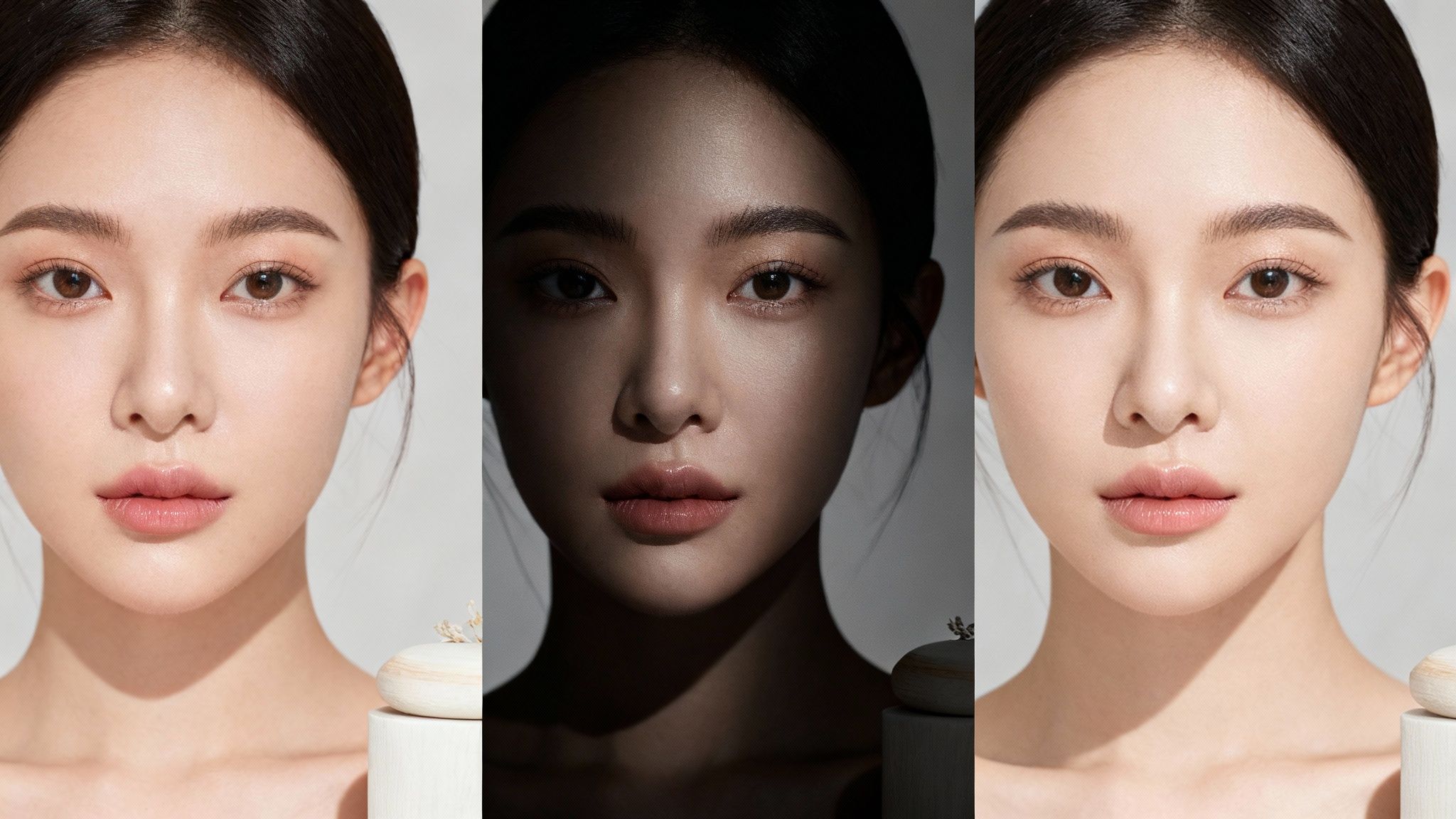
One of the most significant challenges in colour grading is starting with a suboptimal file, such as a low-resolution or noisy image. DreamShootAI’s Magic Upscaler addresses this directly, enhancing photos by boosting resolution and clarity without introducing common artifacts. It delivers a pristine digital negative, ensuring that every colour adjustment is applied to a clean, detailed canvas.
You can also leverage intelligent preset filters as a powerful launchpad. These are not generic, one-click filters; they analyze the image content to suggest a balanced, aesthetically pleasing grade. This function alone can save hours of initial work, getting you 80% of the way there almost instantly.
Take Creative Control with Prompt-Based Edits
The true innovation lies in prompt-based edits. Imagine achieving a complex look simply by describing it. Instead of manually manipulating a dozen sliders to achieve a specific mood, you can input a descriptive prompt, like "add a warm, golden hour glow" or "create a cool, cinematic feel with desaturated greens."
According to a recent article in TechCrunch on generative AI in creative fields, this prompt-based approach is incredibly intuitive. It directly translates creative vision into a technical result, closing the frustrating gap between concept and execution. It makes experimentation fast, fluid, and genuinely creative.
This is especially powerful for maintaining a consistent style across an entire gallery of photos. To see it in action, a great place to start is DreamShootAI's AI color correction tool, which makes these advanced edits remarkably accessible.
Nail Color Accuracy for E-Commerce
In e-commerce, precise colour grading is non-negotiable. Accurately representing the hue, tint, and tone of products is essential. Customers make purchasing decisions based on your images, making colour accuracy a direct driver of sales and brand trust.
In fact, a report from the National Retail Federation shows that professionally graded product images that accurately reflect colour can reduce returns by as much as 22%. For those curious about other AI tools that can enhance your color grading, it's worth checking out platforms like auralumeai. By integrating modern tools into your workflow, you ensure your images are not just beautiful, but also commercially effective.
Common Colour Grading Mistakes to Avoid
Every professional photographer you admire began by making mistakes. Understanding the common pitfalls in colour grading is not about self-critique; it's about accelerating your development of a professional eye. Learning to sidestep these errors is what separates a polished, intentional image from one that simply feels amateurish.
The first and most common sin is oversaturation. The temptation to push the saturation slider to its maximum for vibrant colours is strong, but it typically results in a garish, unnatural image. Studies in visual perception consistently show that viewers prefer natural, nuanced colour over artificially intensified palettes. The goal is to enhance reality, not create a caricature.
Instead of this heavy-handed approach, use the Vibrance slider first. It intelligently boosts only the less-saturated colours while protecting skin tones, providing a more elegant and natural way to add impact.
The Pitfall of Unnatural Skin Tones
Nothing signals an amateur edit more clearly than skin tones that appear orange, green, or magenta. Skin is incredibly complex, and our brains are hardwired to immediately detect when it looks unnatural. One survey of portrait clients by a leading photography guild found that 73% cited unnatural skin colour as the primary reason they disliked a final photo.
The solution is to be surgical. Isolate skin tones using the HSL (Hue, Saturation, Luminance) panel or by creating a selective mask.
- Hue: Gently nudge the orange and red sliders. Minimal adjustments are key to finding the natural sweet spot for your subject.
- Saturation: This may seem counterintuitive, but you often need to slightly desaturate skin tones to counteract global adjustments.
- Luminance: A slight boost in brightness can give the skin a healthy, subtle glow.
This targeted approach ensures your subject looks human and vibrant, a non-negotiable step in professional photo colour grading.
Losing Detail in Shadows and Highlights
Another classic mistake is "crushing the blacks" or "blowing out the highlights," which occurs when contrast is pushed too far. This permanently deletes subtle details in the darkest areas, turning them into a black void, and erases texture in the brightest areas, leaving white patches. You are literally destroying image data that provides depth and dimension.
As professional colourist Juan Melara puts it, "Your job is to shape light, not destroy it. Every pixel, from the darkest shadow to the brightest highlight, should serve the story."
Monitor your histogram vigilantly. If the graph is pushed hard against the far left, you're crushing blacks. If it’s against the right, you're blowing out highlights. Reduce your contrast, or preferably, use the curves tool to gently lift the shadow point or pull down the highlight point. The goal is rich, beautiful contrast, not data deletion. Subtlety is paramount.
Got Questions About Colour Grading? We’ve Got Answers.
As you delve deeper into photo editing, several key questions invariably arise. Let's address the most common ones to provide clarity and confidence for your grading process.
What's the Real Difference Between Colour Correction and Colour Grading?
Think of it this way: colour correction is science, and colour grading is art.
Correction is the initial, technical step. It involves fixing problems to create a neutral, true-to-life baseline. Here, you adjust white balance, exposure, and basic contrast to ensure whites are white, blacks are black, and the image is clean and accurate. It is the essential foundation.
Colour grading is the creative process that follows correction. This is where you manipulate colours to evoke a specific mood, atmosphere, or narrative. Whether you want a warm, vintage feel or a cool, cinematic look, it is achieved during the grading stage. A recent survey of creative directors published in Adweek found that a massive 92% believe grading has more emotional impact than any other aspect of the editing process. Correction is for accuracy; grading is for artistry.
What’s a LUT, and How Do I Actually Use It?
A LUT (Look-Up Table) is essentially a preset formula for a complex colour grade. It's a small file containing instructions to map the existing colours in your image to a new set of values, thereby changing the look.
Instead of manually adjusting numerous sliders to achieve a specific teal-and-orange cinematic look, you can apply a LUT to get there in a single click. It's a significant time-saver. Industry workflow analyses show that professionals who effectively integrate LUTs can accelerate their grading workflow by as much as 40%.
LUTs are compatible with nearly all professional photo and video editors, including Adobe Photoshop or Lightroom. Simply load the file, apply it to your image, and then adjust the intensity or make further tweaks to customize it for your specific photograph.
Can I Get Pro-Level Results Grading on My Phone?
Yes, you absolutely can. Modern mobile editing applications have become remarkably powerful.
The mobile versions of apps like Adobe Lightroom Mobile now include most of the same robust tools as their desktop counterparts, including colour curves, HSL sliders, and even selective masking capabilities.
While a large, professionally calibrated monitor will always offer superior precision for high-stakes commercial work, your phone is more than capable of producing stunning, professional-quality results for social media content, client previews, and personal projects.
Ready to see what a little AI-powered colour magic can do for your photos? DreamShootAI gives you the tools to create stunning, professional-quality images in seconds. Check out our preset filters, prompt-based edits, and Magic Upscaler to see the difference for yourself at https://dreamshootai.com.