How to Change Background Color in Any Photo
Learn how to change background color using AI, Photoshop, and mobile apps. Our guide provides actionable steps for pro-level photo editing results.

Knowing how to change the background color of an image is a foundational skill with a massive impact on visual communication. The methodology chosen—whether AI-powered tools for near-instant results, traditional software like Photoshop for granular control, or mobile apps for on-the-go edits—depends entirely on the project's demands for speed, precision, and convenience.
Why Background Color Is a Game Changer for Your Images
Before delving into the technical how, understanding the strategic why is paramount. A background color swap is far more than a cosmetic tweak; it's a strategic decision that fundamentally alters an image's narrative, mood, and persuasive power. A study by Stanford University revealed that a staggering 75% of users make judgments about a company's credibility based on its website's design, and color is a primary component of that design. The right background can be the deciding factor between a product that sells and one that is overlooked.

This is about making intentional, goal-driven decisions. A luxury watch brand, for instance, might select a deep charcoal or muted cream background to convey sophistication and elegance. Conversely, a tech startup could leverage a vibrant blue or energetic orange to signal innovation. The background sets the entire stage for the subject.
The Psychology of Color in Visuals
The psychological impact of color cannot be overstated. Different hues trigger specific emotions and associations, a principle leveraged by top-tier brands for decades. Consider a corporate headshot: a subtle gray or professional blue background projects trustworthiness and enhances the subject's perceived credibility.
"Color is a power which directly influences the soul," the renowned artist Wassily Kandinsky once stated. In the digital age, this sentiment is the bedrock of visual marketing. "The background is not just a backdrop; it is a critical component of the visual narrative. It guides the viewer's eye, establishes context, and reinforces the intended message without a single word." - Branding Strategist
This concept is a powerhouse in e-commerce, where background choice directly influences conversions. This isn't theoretical; the data is conclusive. For instance, 46% of website users globally prefer blue as their background color, as it's associated with trust and calmness. These principles apply with equal force to a single product photo as they do to an entire website. You can find more fascinating web design stats over at loopexdigital.com.
The benefits are definitive:
- Enhanced Focus: A simple, solid background eliminates visual noise, compelling the viewer's gaze directly onto the intended subject.
- Brand Consistency: Employing a consistent brand color palette across all imagery creates a cohesive, professional aesthetic that builds brand recognition.
- Emotional Connection: The right hue instantly establishes a mood—be it calming, exciting, luxurious, or playful—aligning the image with its strategic goal.
By mastering how to change a background color, one is not merely editing a photo; one is taking command of these powerful visual cues.
Let’s be honest, manual photo editing is a laborious grind. It is a meticulous, pixel-by-pixel process that can consume hours. Fortunately, AI-powered tools have revolutionized this landscape, offering a significantly faster and more intelligent path to professional-grade results. Instead of wrestling with complex layers and selection tools, the user simply articulates their desired outcome in plain English.
This represents a paradigm shift, not just a minor improvement. Studies from McKinsey & Company project that generative AI could automate 60 to 70 percent of tasks that currently absorb employees' time. For graphic designers, this translates to a massive reclamation of creative bandwidth.
Imagine running an online boutique and needing to update an entire product catalog for a new season. Historically, this meant an arduous slog through Photoshop, editing each item. Now, with a tool like DreamShootAI, an image can be uploaded and furnished with a new background in seconds.
The workflow is engineered for simplicity. You upload a photo, and the creative control shifts to your text prompt. This prompt is a direct line to the AI; your command is its directive.
Writing Prompts That Actually Work
The key to achieving superior results from any AI is mastering its "language." Your prompt is the conduit between your conceptual idea and the final rendered image. Vague inputs yield vague, generic outputs. Specificity, however, is where the true potential is unlocked.
Returning to our online boutique example, consider a well-composed shot of a handbag against a cluttered background. The quality of the prompt directly dictates the outcome:
- Vague Prompt: "change background" — The AI will likely make an uneducated guess, producing a random color or a generic scene misaligned with your brand identity.
- A Better Prompt: "change background to a solid warm beige" — This is a significant improvement. The AI now has a precise color directive, which is essential for maintaining a cohesive and professional product line.
- An Advanced Prompt: "professional studio with a soft, light gray backdrop and subtle side lighting" — This is the expert level. The prompt provides context, color, and lighting instructions, resulting in a far more polished and realistic image that emulates a high-end photoshoot.
As any experienced prompt engineer will attest, the initial prompt is merely the opening of a dialogue. Do not hesitate to refine and iterate. Add details about texture, lighting, and overall mood to guide the AI toward your precise vision.
This iterative process of refinement is where the true power lies. Dozens of creative concepts can be tested in minutes, eliminating the need for manual execution.
Going Beyond Solid Colors with Virtual Try-Ons
Modern AI tools possess capabilities far beyond simple color swaps. This same technology can place a product into entirely new, photorealistic environments—a feature often termed a virtual try-on. For our boutique owner, this means taking that same handbag and instantly visualizing it in diverse settings.
Consider the possibilities:
- Lifestyle Shot: "place the handbag on a marble cafe table, next to a cup of coffee"
- Travel Scene: "handbag sitting on a rustic wooden bench overlooking a beach at sunset"
- Urban Vibe: "a model holding the handbag on a bustling city street with blurred lights in the background"
This is a complete game-changer for marketing. Small businesses can now generate a vast portfolio of diverse lifestyle images without the significant time and capital investment of a physical photoshoot. The ability to instantly change your image background color or scene unlocks creative avenues that were previously inaccessible. For those in specialized fields, resources on AI tools for creating 3D gaming backgrounds demonstrate the advanced state of this technology.
Ultimately, using AI to change a background is not just about efficiency. It is about democratizing creative potential. You can experiment, iterate, and produce a high volume of quality content that perfectly aligns with your brand vision—all with a few lines of text.
Want to see how easy it is? Go ahead and give an AI background color changer a try and see for yourself.
How to Select the Perfect Background Color
Choosing a background color is not a matter of arbitrary preference; it is a strategic decision that fundamentally alters an image's perception and performance. The correct color can make a product stand out, lend credibility to a professional headshot, or inject emotion into a creative portrait. The key is to align the visual aesthetic with the intended goal.
For e-commerce, the objective is nearly always clarity and focus. There is a reason that crisp whites, soft grays, and subtle off-whites are the industry standard: they eliminate distractions, ensuring the product is the undisputed hero of the image.
This entire process, once a significant undertaking, has been streamlined by modern AI tools to just a few clicks. This infographic illustrates the new reality of background editing.
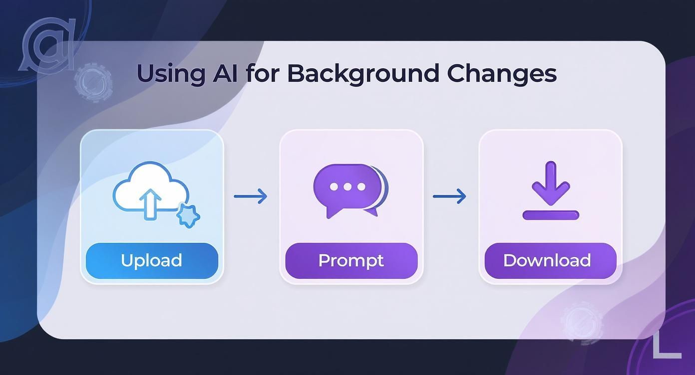
As shown, the workflow is now remarkably straightforward: upload the image, type a concise prompt describing the desired background, and download the result.
Aligning Color With Your Goal
The narrative of your image should dictate your color palette. A professional headshot, for example, must project confidence and competence. Muted, trustworthy colors like a deep navy blue or a solid charcoal gray convey authority without detracting from the subject.
Creative portraits, in contrast, offer a canvas for expression. Here, one can employ vibrant tones, artistic gradients, or bold, contrasting colors to amplify the mood. Before selecting a color, ask one critical question: "What is the primary message of this photograph?"
As a principle of design, an effective background color must always support the subject, never compete with it. Its purpose is to enhance the focal point, guide the viewer’s eye, and solidify the image’s core message.
To demystify this process, this quick-reference table has been compiled to aid in your next edit.
Background Color Selection Guide by Goal
| Project Goal | Recommended Colors | Psychological Association | Best For |
|---|---|---|---|
| Increase Product Sales | White, Light Gray, Beige | Cleanliness, Simplicity, Focus | E-commerce, Marketplaces |
| Convey Professionalism | Navy Blue, Charcoal Gray | Trust, Stability, Authority | Corporate Headshots, LinkedIn |
| Evoke Creativity | Vibrant Tones, Gradients | Energy, Originality, Emotion | Artist Portfolios, Social Media |
| Create a Calm Mood | Soft Blues, Sage Green | Serenity, Nature, Peace | Wellness Brands, Personal Photos |
This guide links common project goals with colors that are psychologically proven to support them, ensuring your aesthetic choices are also sound strategic decisions.
Accessibility and Technical Basics
Beyond creative considerations, certain technical details are non-negotiable, particularly for web-bound images. High contrast is essential. With a significant portion of users browsing on mobile devices, images must be instantly clear and legible.
This is where accessibility guidelines are indispensable. The Web Content Accessibility Guidelines (WCAG) recommend a contrast ratio of at least 4.5:1 for normal text against its background. Adherence is not merely about compliance; a report from the Nielsen Norman Group found that websites following these rules saw a 30% improvement in user satisfaction. You can dive deeper into this with Wix's guide on website color trends.
Finally, a working knowledge of color codes is beneficial. HEX codes (e.g., #FFFFFF for pure white) are the universal standard for web design, while RGB values (e.g., 255, 255, 255) are used for digital displays. Fortunately, virtually all modern editing tools accept both formats, providing pixel-perfect control over the final image.
Other Powerful Tools in Your Background-Changing Toolkit
While AI tools offer unparalleled speed and simplicity, they are not the sole solution. Certain projects demand different approaches—whether it's the surgical precision required for a high-stakes commercial shot, a rapid edit on a mobile device, or a template-driven design for social media.
A broad awareness of the available tools ensures you can select the optimal instrument for any given task. The photo editing software market was valued at $968.2 million in 2022 and continues to expand, a testament to the diverse needs of creators. One day may call for the power of a digital scalpel; the next may require nothing more than a simple mobile application.
The Professional Standard: Adobe Photoshop
When perfection is the only acceptable outcome, Adobe Photoshop remains the undisputed industry standard. For decades, it has been the definitive tool for professional photographers and designers who require absolute control over every pixel. For a magazine cover or a massive billboard, this is the professional's choice.
The Photoshop workflow centers on creating a clean selection of the subject and utilizing layer masks for non-destructive editing.
- Initiate with 'Select Subject': Photoshop's integrated AI provides a strong baseline selection, significantly reducing manual effort.
- Refine the Edges: Enter the 'Select and Mask' workspace. This is where meticulous refinement occurs, allowing for the fine-tuning of complex areas like hair or fabric textures.
- Apply a Layer Mask: Once the selection is perfected, apply it as a layer mask. This action hides the background rather than deleting it, preserving the original data for future adjustments.
- Introduce the New Background: Create a new 'Solid Color' fill layer and position it beneath the subject's layer. The background color can now be changed instantly by modifying this fill layer.
This is the command center where all that precise editing goes down.
The power of this workflow resides in the layers panel on the right. It is the core of Photoshop's functionality, enabling the stacking and adjustment of various elements without destructively altering the original image.
Quick Edits with Web and Mobile Apps
Realistically, not every edit requires a heavyweight desktop application. With a staggering 79% of photos now captured on smartphones, according to Statista, mobile and web-based editors have become incredibly powerful. They are ideal for enhancing social media posts, creating rapid product mockups, or improving personal photos.
Canva (Web-Based): A ubiquitous tool for social media design, Canva is renowned for its user-friendly, template-first approach. For Pro users, its one-click background remover is a critical time-saver. Once the background is isolated, it can be replaced with a solid color, a gradient, or one of millions of stock assets in seconds. The platform is optimized for speed and brand consistency.
For a free and focused alternative, a dedicated web-based background remover tool can get the job done in a pinch, too.
Bazaart (Mobile App): The capabilities of mobile applications should not be underestimated. Bazaart is a potent editor that fits in your pocket. Its "Magic" tool removes backgrounds instantly. From there, users can add new colors, artistic backdrops, or even create collages with other images.
As one mobile editing expert noted, "The goal of a mobile app is to get you from concept to a shareable result in under five minutes. Tools like Bazaart excel at this by focusing on intuitive controls and fast processing."
Whether you need the microscopic control of Photoshop or the lightning-fast convenience of Canva, knowing your options provides complete creative autonomy, allowing you to select the right tool for the moment.
Nail the Landing: Exporting Your Image and Dodging Common Mistakes
You have successfully replaced the background, and the image looks sharp. However, the process is not complete. The final step—exporting—is a critical juncture where many excellent edits are compromised. An incorrect export setting can negate your hard work, resulting in a pixelated file or one that fails to load correctly.
Think of file formats as specialized containers, each designed for a specific purpose. Selecting the appropriate one is the first crucial decision.
- JPEG (JPG): The workhorse for most photographic images. It provides excellent compression to minimize file sizes, which is vital for website loading speeds. For images with a solid, opaque background, JPEG is typically the optimal choice.
- PNG: The undisputed champion of transparency. If a background has been removed to allow the subject to be placed over various website colors, saving as a PNG is mandatory. Exporting as a JPEG will result in a solid white box where transparency was intended.
- WebP: A modern format developed by Google to surpass both JPEG and PNG in quality and compression efficiency. It supports transparency and is rapidly becoming the web standard, though one should verify platform compatibility before use.
Troubleshooting Pesky Editing Flaws
Even with sophisticated tools, subtle imperfections can persist in the final image. The ability to identify and correct these flaws is a hallmark of professional work. One of the most common indicators of a background swap is a mismatch between the lighting on the subject and the new environment.
"The human eye is incredibly sensitive to inconsistencies in light and shadow," notes a professional photo retoucher. "A subject lit from the left placed on a background lit from the right will always feel 'off,' even if the viewer can't explain why. Cohesive lighting is the secret to a believable composite."
Another common issue is the presence of color halos or harsh, pixelated edges around the subject. This typically occurs when remnants of the original background "bleed" onto the subject's edges. This can often be corrected by feathering the selection mask slightly or by using a de-fringe tool to neutralize the unwanted color.
If the overall image appears incongruous, the issue may be color balance. A final adjustment with a dedicated color correction tool can be invaluable, helping to harmonize the subject and the new background into a cohesive whole.
Finally, always consider the image's destination. An image for an Amazon product page is subject to different rules than one for an Instagram feed. Amazon, for example, strictly requires a pure white background (RGB 255, 255, 255). Instagram, by contrast, favors vibrant, high-contrast visuals. Always consult the latest image guidelines for your target platform before finalizing your export.
Frequently Asked Questions
Even with a firm grasp of the fundamentals, certain questions frequently arise. Addressing these details is what elevates an image from competent to truly professional.
Can I Make a Photo Background Transparent?
Yes, this is a standard function. Most capable editors, from AI-driven platforms to Adobe Photoshop, allow for the complete removal of a background to create transparency.
The critical step is the export process. The file must be saved in the PNG format. Attempting to save a transparent image as a JPEG will cause the format to automatically fill the transparent areas with solid white, negating the intended effect. A transparent background is non-negotiable for elements like logos or e-commerce products that must be placed seamlessly on various web page designs.
How Do I Make the New Background Actually Look Realistic?
Achieving a believable new background hinges on two key elements: lighting and shadows. These are the visual cues that convince the human eye of an image's authenticity.
First, the direction and quality of light on your subject must align with the lighting in the new background. If your subject is lit from the left, placing it into a scene where the primary light source is on the right will immediately look artificial.
Second, a subtle shadow must be added to ground the subject in its new environment. Many AI editors are becoming adept at generating these automatically. If performing this manually, creating a soft, diffused drop shadow is essential for connecting the subject to the new background.
This is not merely an aesthetic concern. A study from marketing analytics firm Beckon revealed that ads with natural, contextually relevant visuals saw a 12% higher click-through rate. Realism yields tangible results.
What’s the Best Background Color for a Professional Headshot?
For professional headshots, neutral and muted colors are almost always the correct choice. The objective is to maintain complete focus on the individual, not the background.
The following are industry-standard options that consistently perform well:
- Shades of Gray: Light, medium, or deep charcoal gray backgrounds are timeless, professional, and do not distract the viewer.
- Deep Navy Blue: This color has a powerful psychological association, often conveying trust, stability, and confidence, making it an excellent choice for corporate profiles.
- Soft Off-White: A warmer, more approachable alternative to stark clinical white. It provides a clean look without being harsh.
As a rule, avoid highly saturated or bright colors unless they are integral to a specific, creative personal brand.
If you have more questions about how artificial intelligence is being used in product imaging and how it affects things like backgrounds, you can explore FAQs on AI product photography.
Ready to create stunning, professional-quality images without the hassle? With DreamShootAI, you can change backgrounds, generate entire photoshoots, and perfect your pictures with simple text prompts. Transform your ideas into reality today at https://dreamshootai.com.
Written by Jocelyn Grey for the DreamShootAI blog.
Spotted something out of date? Tell us at [email protected] and we'll fix it.